Accessibility
Designing and building products and services so that all can equitably access and use our them.
Contents
Accessibility basics
We follow WCAG's 4 principles of web accessibility
- Perceivable - Information and user interface components must be presentable to users in ways they can perceive.
- Operable - User interface components and navigation must be operable.
- Understandable - Information and the operation of user interfaces must be understandable.
- Robust - Content must be robust enough that it can be interpreted reliably by a wide variety of user agents, including assistive technologies.
We want as many people as possible to be able to use our website products and services. For example, that means users should be able to:
- zoom in up to 300% without the text spilling off the screen
- navigate most of the website using just a keyboard
- navigate most of the website using speech recognition software
- listen to most of the website using a screen reader (including the most recent versions of JAWS, NVDA and VoiceOver)
- all images used in websites include descriptive ALT attributes, which describe the image for non-visual readers.
- all links have title attributes, which describe the link in greater detail
Baseline & guidelines
We aim to meet AA WCAG standard for accessibility, as set out in WCAG 2.1
Accessible design
Designing with a focus on accessibility is a good process, to ensure all can access and use our services - equally. The Design System contains components that have been tested and assessed for accessibility, but their use alone does not ensure pages will be sructured correctly, or that interactions enable users to meet their outcomes.
Components have been built, maintained and reviewed along WCAG 2.1 guidelines, ensuring colour contrast levels are at least AA, that labelling is clear and screen reader compliant, touchpoint sizes are sized appropriately and more complex components are accessibly functional. The way these components are organised together (in atomic design practice, into organisms and pages) is where good design comes in.
Design good practice is summarised well in Google Material design and we aim to work with software engineering teams, to meet this standard.
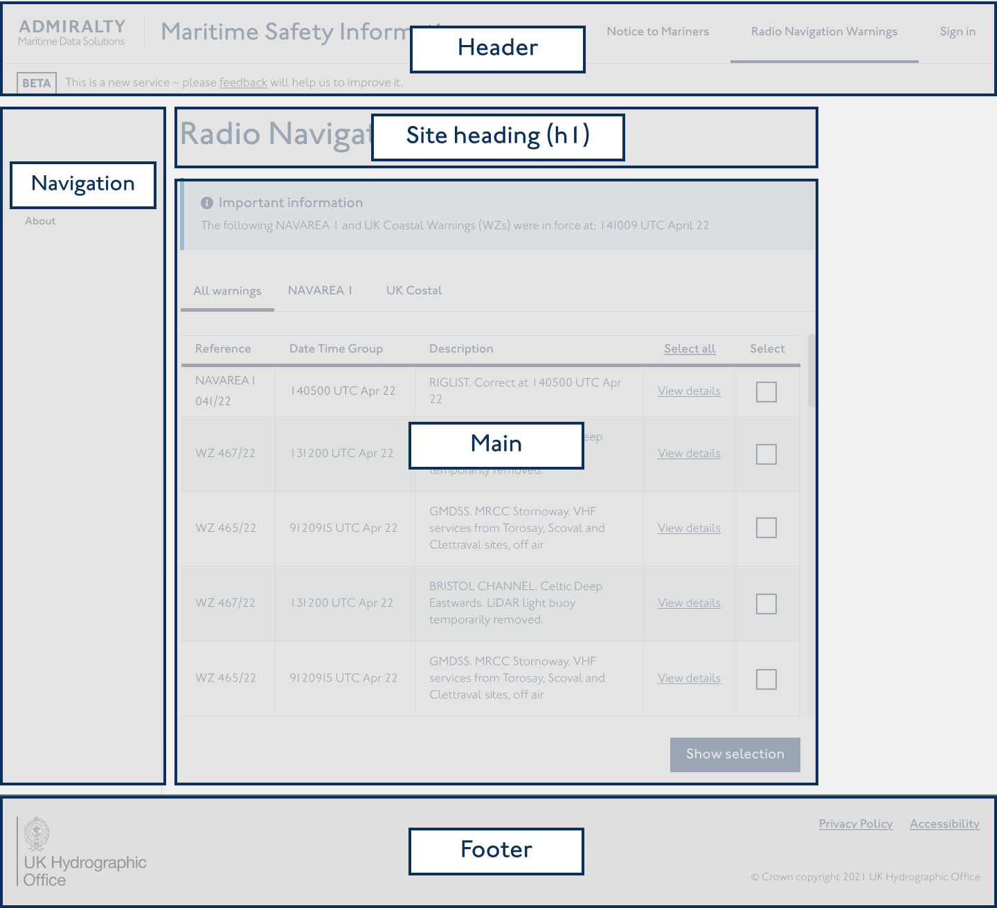
Good use of the Design System main page components - header, footer, navigation components, headings - provide familiar and easy-to-navigate page structures with good hierarchies.
Implementing design with a content first approach also makes designing page hierarchies easier. Breaking up content into manageable amounts, organising user flows intuitively and ensuring users can eqaully access content.
We try to keep accessibility as a core focus, with consistent collaboration with QA testing teams, use of accessibility plug-ins in Figma and design reviews with the wider Practice. User and QA testing should be accessibility compliant to learn how users are actually interacting with products and services.