Find a location
Use the find a location pattern to show location-based information alongside an interactive map. It helps users understand where things are and access detailed information about a place.
Overview
The ‘Find a Location’ pattern should be used when users need to interact with location-based content. It works best when the map and panel support each other, the map provides spatial context, and the panel gives details and actions.
Use this pattern to help users explore and understand where things are, and what they can do with that information.
When to use this pattern
Use the geo-display pattern when:
- You’re showing multiple results or locations that users need to compare on a map.
- Users benefit from seeing the geographical relationship between places, like distance or clustering.
- You want to support both overview and detail, the map helps users get a sense of where things are, and the panel provides more in-depth information.
- The map supports user tasks like selecting a place, viewing services, or taking action.
When not to use this pattern
Avoid using this pattern when:
- You only need to show a single, static location with no user interaction.
- The map doesn’t add value to the task or could distract from the content.
- The information is better presented in a list, table, or step-by-step format.
- The map is decorative and not functional.
Good practice
Keep the following in mind when using this pattern:
- Keep the content focused. Don’t overload the map or panel with unnecessary information, show just enough to help users decide or act.
- Keep interactions consistent. When a user selects a pin on the map, the panel should update. When they select a link or area of interest in the panel, the map should reflect that.
- Provide feedback. Highlight selections clearly, both on the map and in the panel, so users can track what’s active.
- Make it actionable. If there’s a next step, like making a payment, or reporting an issue, put that in the panel.
- Optimise for performance. If you’re showing a lot of data, use lazy loading, clustering, or pagination to keep the interface fast and clear.
- Ensure accessibility. Provide alternative ways to get the same information, for example, a text-based list or results summary, so users who can’t interact with the map aren’t excluded.
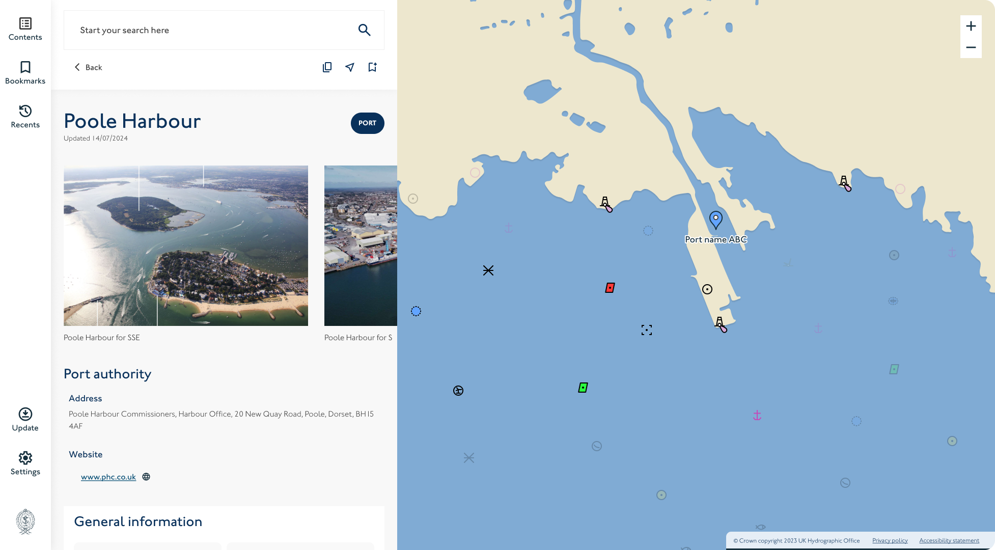
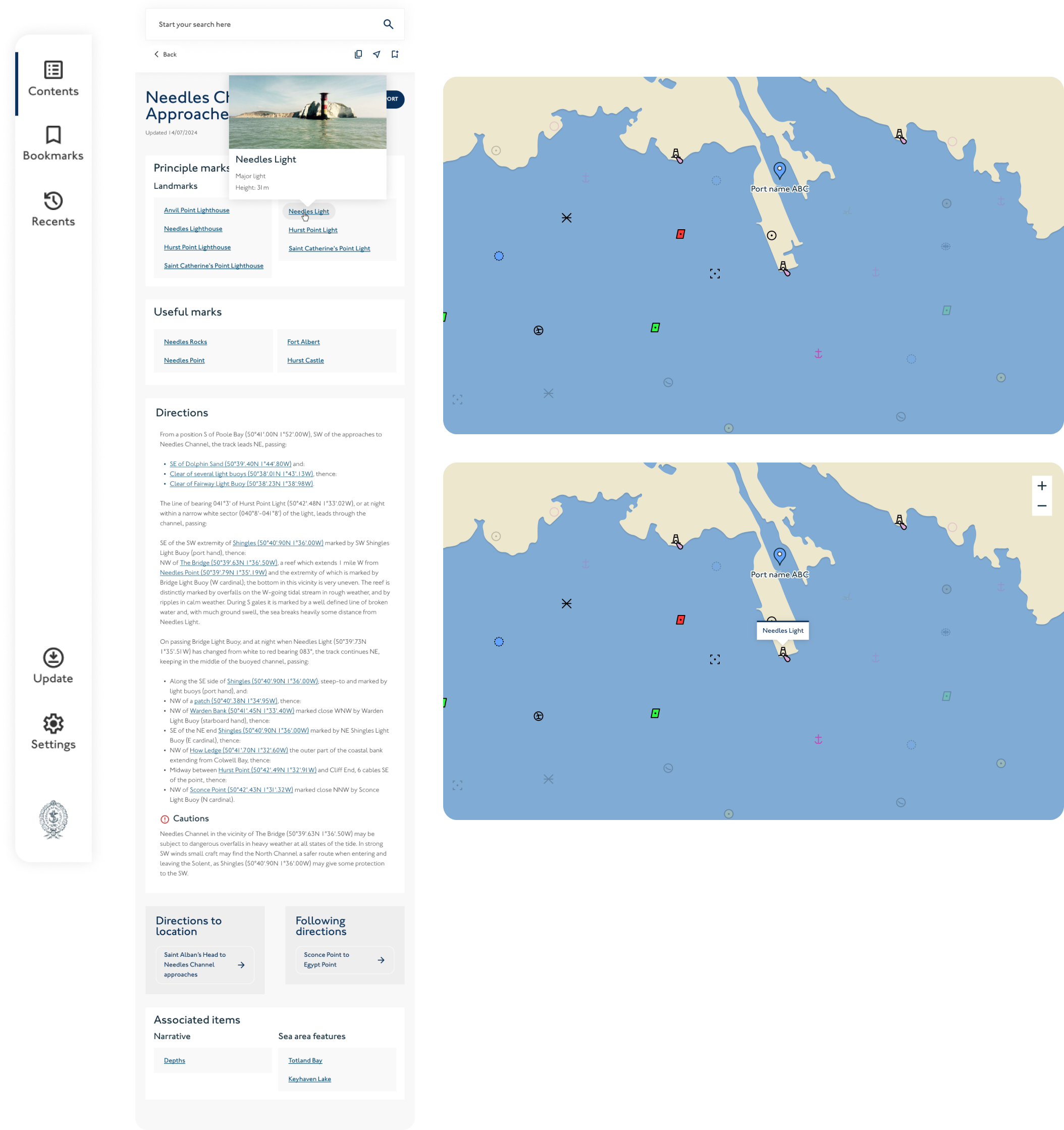
Anatomy
The geo-display pattern has five main parts:
- Sidebar navigation
- Map container
- Content side panel
- Tooltips
- Map controls
Each part plays a specific role in helping users explore, understand and interact with location-based content.
Sidebar navigation
A fixed vertical menu on the left-hand side of the screen.
- Provides global or contextual navigation
- Helps users switch between different map views, pages or data layers
- For more information see our Sidebar navigation page
Map container
An interactive map that displays the spatial layout of relevant data.
- Shows markers or pins for key locations
- Supports user interaction (zoom, pan, click, view layers, filter)
- Dynamically updates based on the user’s selection or filters
Content side panel
A dynamic panel that displays detailed content about a selected item or search result. Optional elements include:
- Search
- Images
- Icons such as bookmark, share, copy.
- Pills
- Pagination/ steps
- Text and navigational links
Tooltips
Tooltips are small, contextual hints that appear when users hover over or focus on a map pin, icon, or control.
- Use to show brief, supplementary information, for example, a location name or summary
- Should never contain essential information that isn’t available elsewhere
- For more information see our Tooltips component page
Avoid tooltips for core interactions, rely on clear labels, icons, and panel content for primary information.
Map controls
Map controls help users adjust the view and explore spatial data efficiently.
Common controls include:
- Zoom in/out
- Reset or re-centre view
- Toggle layers or overlays
- Current location (if applicable)
Controls should:
- Be clearly visible against the map background
- Have consistent placement (usually top-right or bottom-right)
- Include clear focus states and visible labels for screen readers
- Meet the minimum touch target size of 44x44px
Avoid overloading the map with too many controls, prioritise the ones that support your users’ main tasks.
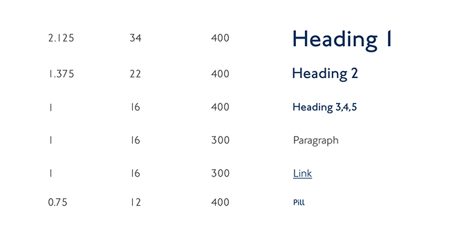
Typography
The side panel uses the smaller typographic scale from the design system. This ensures text remains clear and readable in more compact layouts without overwhelming the interface.
Headings, body text and links follow the same hierarchy and spacing as other components. Use consistent text sizes, weights and line heights to maintain visual rhythm between the panel, sidebar and map.
Spacing:
The pattern uses the design system’s 8 point spacing scale to create consistent rhythm and alignment across the layout.
Use spacing tokens to separate sections, group related elements and maintain visual balance between the sidebar, map, and side panel.
- Apply smaller increments (12px) for tight relationships, such as between labels and their content.
- Use medium increments (20px or 28px) for spacing between components within the same section.
- Apply larger increments (40px) to separate major areas, such the start of a new content section or image.
- Keep spacing consistent with the rest of the design system, don’t introduce new values outside the scale.
Accessibility:
The geo-display pattern must be usable by everyone, including people who use screen readers, keyboard navigation, screen magnifiers, or who have cognitive or motor impairments. It includes interactive elements (like maps, panels, and navigation), so it's especially important to get accessibility right.
1. Keyboard navigation
- All interactive elements (sidebar links, map controls, buttons, etc.) must be reachable and operable using a keyboard alone.
- Use logical tab order. Focus should move in the order: sidebar → map controls → side panel content.[
- Ensure focus moves appropriately when dynamic content is opened (e.g. when a panel opens or updates with new details)
2. Screen reader support
Use ARIA landmarks and roles to help screen reader users navigate the layout:
- nav for sidebar navigation
- main for map and panel area
- aside for the side panel
Use aria-labels or aria-labelled by to clearly describe:
- The map region (e.g. "map showing location results")
- The panel (e.g. "Location details panel")
- Any dynamic elements (e.g. "3 search results")
For map markers, provide accessible names (e.g. via aria-label or hidden text) describing what each marker represents.
3. Visual clarity and readability
- Maintain a minimum contrast ratio of 4.5:1 for text and interactive elements (this includes sidebar links, panel content, and any text over the map).
- Use GDS-approved text sizes (16px minimum for body text) and consistent spacing to support readability (see Geo-display spacing and typography).
- Avoid relying solely on colour to convey meaning, use text labels, icons, or patterns where needed (e.g. for pin types or map overlays).
4. Map accessibility
Interactive maps are not accessible by default, provide alternative ways to access map content:
- Include a textual list of results in the side panel
- Ensure all actions available on the map (e.g. selecting a location) can also be done from the panel or sidebar
- Ensure contrast between elements on the map meets a minimum contrast ratio of 4.5:1.
Use ARIA roles like role="application" only if you manage keyboard behaviour inside the map, otherwise, leave it as role="region" or role="group" with a descriptive label.
Avoid locking focus inside the map unless absolutely necessary.
5. Responsive and zoom support
The layout must work when users:
- Zoom to 200% or use high contrast mode
- Switch to portrait mode or use smaller screen sizes
Use relative units (rem, %, em) rather than fixed pixels wherever possible. Don’t hide critical information when the layout collapses: for example, the side panel must still be accessible on smaller screens.
6. Motion and transitions
Avoid or minimise animated map transitions (e.g. zooming or panning) that could cause motion sensitivity.
7. Testing
Test the pattern using:
- Screen readers (VoiceOver, NVDA, or JAWS)
- Keyboard-only navigation
- Zoomed layouts (up to 400%)
Run checks with accessibility tools like axe, Lighthouse, or WAVE to catch contrast and landmark issues.